We gained +10% in conversion rates thanks to a new, improve UX layout based on data insights we had.
Form Facelift v1.0
Goals
Primary metric
Conversion rate
Secondary metric
Uplift
Variant 1
10%
Variant 2
%
P-Value
Variant 1
0.04
Variant 2
Hypothesis
We knew that the App’s Form Page is the hardest step of the entire funnel (~70% of the drop-off in July). Based on Formisimo & GA analysis, we know that users tend to not see the dropdown with subjects to choose from. Also, they have problems with validation errors. We’re asking there for 12-14 fields (what causes psychical friction), without any information about why that information is required (what causes cognitive friction).
We believe that optimizing the form fields through the design/functional changes will decrease the psychical and cognitive friction for all new users and will result in a higher number of conversions.
We’ll know by testing the “Facelift of current cancellation form” experiment on the App’s Forms Page and observing the CTR to the shipping page and final CVR to submitted cancellation for at least 2 weeks to see an uplift of at least 7.21%.
List of changes
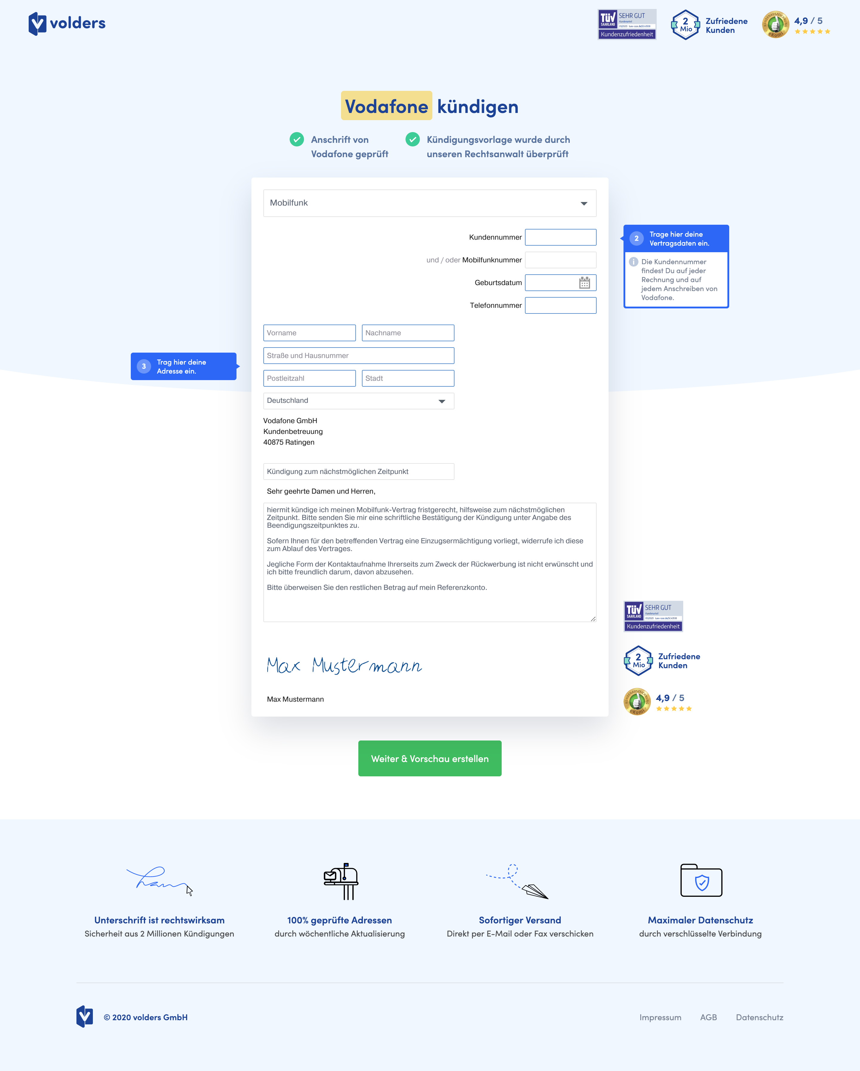
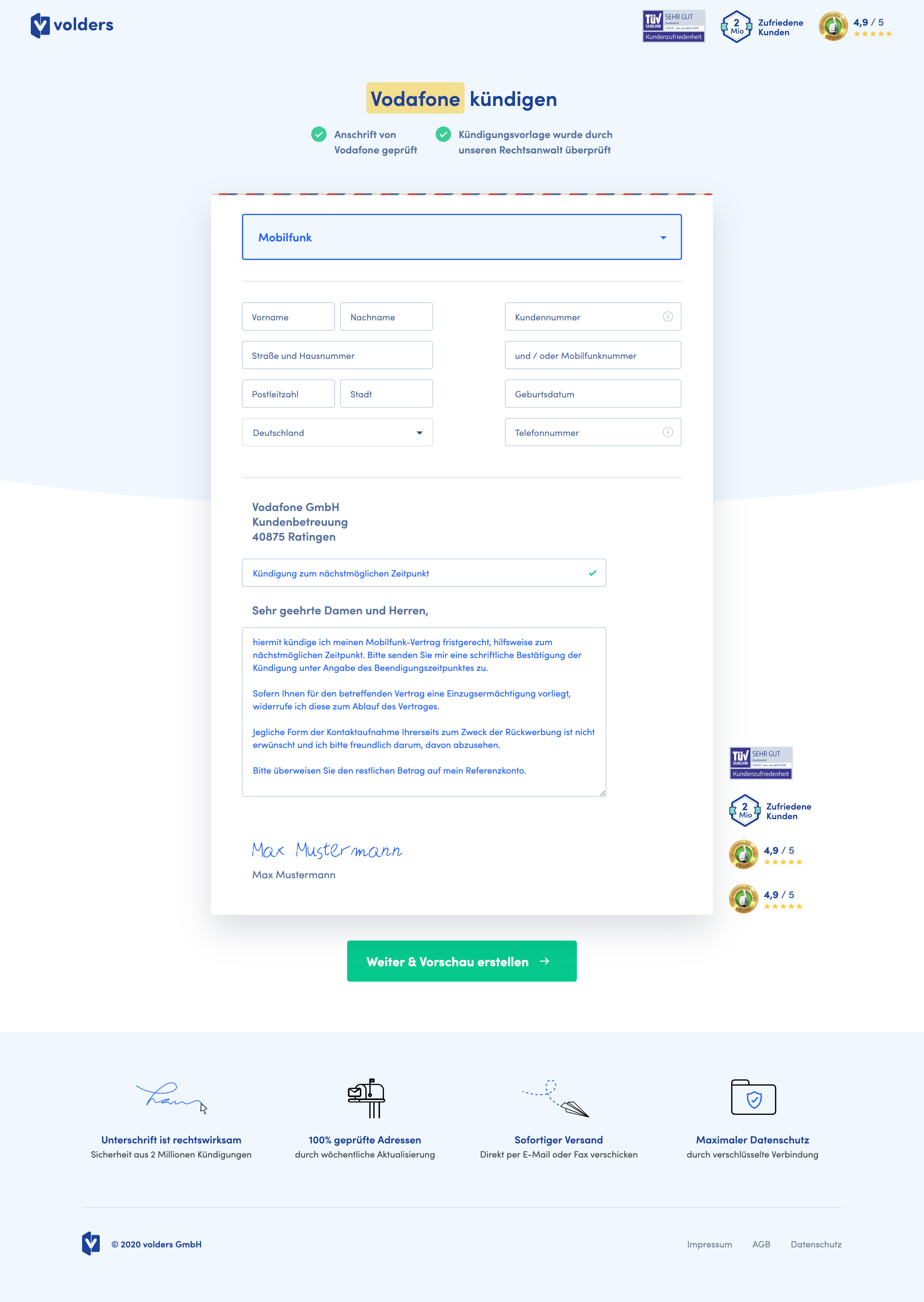
facelift_v1_Control[mobile & desktop]facelift_v1_V1– new design of the letter [mobile & desktop]
In V1, we’ll check how the design and UI changes affect the CR to filling out the form (no major flow changes).- Bigger inputs and placeholders.
- No labels at the beginning – only placeholders, after typing in the value, the placeholder becomes a label.
- “Fake validation” for the form’s inputs. E.g. We use green color or checkmark if the input is filled. We use red color, other symbols/validation text if someone made the required field active, but left it empty.
- The vendor’s address looks consistent with typography
- No birthdate calendar field!
- “i” tooltips next to the:
- Primary identification field with info where to find it;
- Telephone number field with info why we need it;


Observations & Results

Conversion rates to submitted cancellations and to the next step
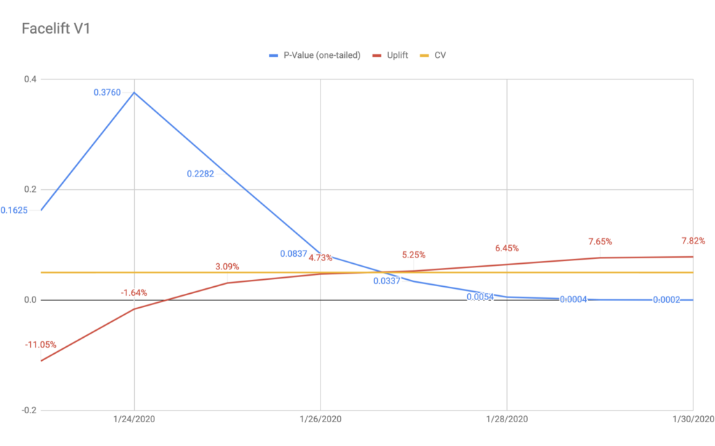
- V1 won significantly by 7.82% by all means: p-values (0.0002); statistical power (94.11%); minimal sample size and MDE after 1st week. According to CXL calculations, this should bring us ~2.4k more cancellations monthly.
- V1 also won when assessing the CR to visiting the next step (the shipping page). Compared to the Control, it brought 2.08% more users to the shipping page (p-value = 0.047), however, without meeting the minimum sample size. Thus, we would need more data to be sure about that.
- Having such a discrepancy could indicate that the V1 somehow strengthen the motivation of the users to finish the process, even though nothing changed on the shipping page.
- Both mobile and desktop in V1 performed better. Mobile with a slightly higher uplift (7.53%) then Desktop (6.40%). Both statistically significant, however with slightly too little traffic.
- We don’t know that for sure, but we assume that mobile worked a bit better because of bigger and wider inputs, and the fact that the birthdate & phone number fields were transformed into numeric inputs on Mobile.
HotJar maps
- (Desktop & mobile) Scroll-maps: There was no visible change in the scroll behavior.
- (Desktop & mobile) Click-maps: There’s a significant change in how users interact with the input fields in V1:
- There are fewer people who were clicking on the input fields compared to Control.
- Only the contract/contact fields were affected. The subject&letter fields stayed intact.
- In V1 the dropdown arrow seems to bring more attention and clicks, however, we could have just too few clicks recorded (contract dropdown is not always visible)
- (Desktop) Movement maps: The patterns observed in the click maps are confirmed here. With additional insights:
- The contact & contract inputs bring less attention in V1 when compared to Control.
- The letter and subject bring more attention in V1 than in the Control.
UX bugs and quantitative analysis of user behavior
- V1 decreased the number of users who were editing the cancellation subject or letter (-20.8%, -13.6% accordingly)
- Our main assumption is that having the “green tick” in the subject input reassures users that the subject is valid and doesn’t need to be changed. This assumption is based on the HotJar recordings and pattern we’ve seen (however, it didn’t appear frequently).
- V1 led to a 23% increase in the number of validation errors displayed (especially in the contract dropdown, where almost 88% more users saw the validation error).
- The almost doubled number of people who didn’t choose the contract dropdown was most probably caused by the dropdown’s design. In V1 it could look a bit disabled because of the background while being unnoticeable because of being very similar to the page background. Also, in the Control, there was a tooltip next to the contract dropdown, which told users where to start to process.
- Most probably, the overall increase of validation errors was caused by making all of the contact & contract inputs not that prominent as the letter/subject/signature components. The grey placeholders in the inputs could be treated as the disabled/already filled-in values, while the lower elements were taking the entire attention. On the recordings, we could even see that some users were omitting the inputs and started to edit the signature first.
- V1 also made more people edit the signature compared to the Control (+25%).
- Most probably (based on the HorJar recordings) this was caused by the new font-color of the signature ($vivid-blue). Having the sample signature (“Max Mustermann”) in such a prominent color made more people edit the signature right away after they landed on the page.
Final Report
V1 won and we’re rolling it out to production as soon as possible (that is on Jan 31st).
At the same time, we have created a tweak of V1 (V1-2) where we addressed all of the UX bugs and improvements. The V1-2 will be tested at the beginning of February, to see if any of them bring even higher uplifts. The concept of the new experiment can be found here: Facelift V1-2 .
