We improved CVR by +6.7% thanks to a couple of tiny changes we derived from the previous experiment.
February 21, 2020
Form Facelift v1.1
Goals
Primary metric
Conversion Rate
Secondary metric
Uplift
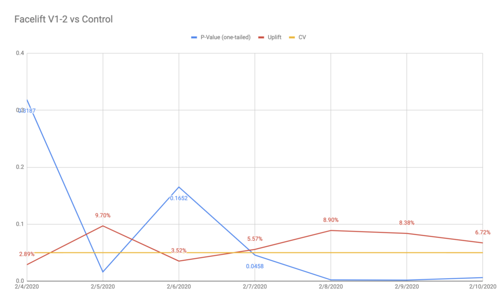
Variant 1
6.72%
Variant 2
%
P-Value
Variant 1
0.0062
Variant 2
Hypothesis
We know that the App’s Form Page is the hardest step of the entire funnel (~70% of the drop-off in July). Based on Formisimo, GA analysis, and the insights from the previous experiment, we know that users had issues with proper understanding of the information architecture, how inputs work and what they need to do on the newly improved app’s form page (here’s the detailed analysis).
We believe that optimizing the form fields through the design/functional changes will decrease the cognitive friction for all new users and will result in a higher number of conversions due to fewer users being confused what they need to do.
We’ll know by testing the “Form Facelift v1.1” experiment on the App’s Forms Page and observing the CTR to the shipping page and final CR to submitted cancellation for at least 2 weeks to see an uplift of at least 7.21%.
List of changes
facelift_v2_Controlfacelift_v2_V1-2– That’s a tweaked V1 version, where we slightly changed styles and design to provide better UX. All of the improvements were based on the HotJar and GA analysis. Including:- Bring back the headline above the contract dropdown.
- Improved (compared to V1) contract dropdown designs, as we know from HorJar recordings the one from V1 didn’t work well.
- Inputs without placeholders, but with labels visible upfront.
- Reverting the font color of values and signature to be rather black/grey ($blueish in DS) then prominent blue ($vivid-blue in DS).
Screenshots

Observations & Results
HotJar maps
- There was no differences in the scroll behavior between users.
- When evaluating the click and movements maps (desktop & mobile), we could see that:
- In
Control with UX improvementsless users where clicking on various parts of the inputs. Please keep in mind thatControl with UX improvementswon and brought more cancellations, so fewer clicks or weaker mouse movements are a good thing here. - While in the
Control, mainly the clicks were present on the right side of the input (where the placeholder ends), inControl with UX improvementson all inputs we can see that users were clicking at the beginning on the input. This difference could be specially noticed on mobile. - The maps look clearer and more “calm” for
Control with UX improvementswhat suggests that the behavior of the users was much more structured and understandable. - Reverting the color font for the subject and letter also led to way fewer interactions with the subject and title in
Control with UX improvements.
- In
Converstion rates
- Control with UX improvements won over Control with the statistical significance and almost big enough sample size.
Control with UX improvementsbrought 6.7% – 8.9% uplift in the last days with very low p-values (one-tailed: 0.0018 – 0.0062).- That result along with qualitative HotJar analysis confirm that the UX improvements to the form increased the ability and motivation what led to a higher number of cancellations in the end.
- The results were significant and almost met the Minimal Detectable Effect and Minimal Sample Size. The day before, both conditions were met.
- On the mobile, the
Control with UX improvementswon with a 4.94% uplift, but without significance (p = 0.097). - On the desktop, the
Control with UX improvementswon with a 7.66% uplift. With significance, however, a bit too little traffic/uplift. - Thus, we can safely say, that the overall win of
Control with UX improvementswas done most probably thanks to desktop users.
- Reaching the shipping page so the micro-conversions, suggests that there’s no difference in how any of the variants perform. According to Bayesian analysis in VWO, none of the variants tended to beat each other.
- That odd observations suggests us, that the test variant affects positively the motivation of the users, who are more willing to finish the cancellation process on the shipping page.
Final Report
Control with UX improvements goes to production (Feb 11th, 2020), as it led to 6.7% – 8.9% uplift that was highly significant.
When the above is done, we’ll start a new experiment between Control with UX improvements (as a Control) and Multistep form with UX improvements to see who will win.
As idea for new hypothesis, for sure we should test how placing the easy fields (contact data) as a first step, and contract fields as the second step, would affect the final CR.