How we led to a 114% CR boost of trials
Back in December 2016, we were looking for a quick win for our freshly assembled Growth Hacking Team. I’ve looked at our main traffic sources and decided to optimize the biggest one – chat_window.
The test resulted in a 114% conversion boost and hundreds of extra trials monthly from this source.
Read on to learn how we analyzed, designed and optimized the traffic.

What’s the chat_window source?
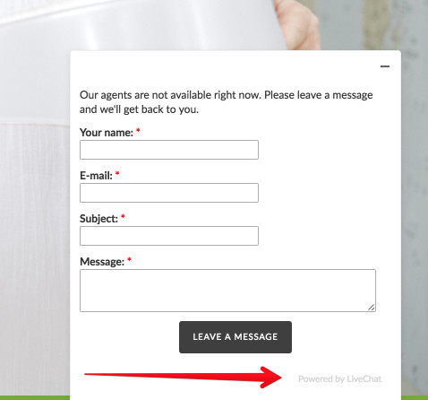
Chat_window source is the entire traffic sent our way from “Powered by LiveChat” links placed at the bottom of chat windows on our customers’ sites.

People who click on this link, land on the LiveChat page (in most cases) by mistake as they’re looking for our customers’ support. The traffic quality is not that delightful, but hey, we count them in hundreds of thousand sessions monthly (and counting with each new client).
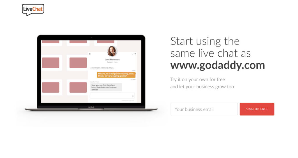
For all those years, this chat_window traffic has been redirected to our homepage without providing the visitors with any personal experience. We were missing out on big time.
Part I. Analysis
Analysis – Business arguments
According to the data in Google Analytics, we’ve estimated improving the conversion rate by 0.8 percent points (from 0.6% to 1.4%) will bring us hundreds of trials more. That seemed doable.

Analysis – User behavior
If there’s one thing I can recommend to you before optimizing any landing page, it’s a deep analysis of users you’re targeting. The crucial thing here is to identify them based on data you have (or you need to get first), not your guts or imagination.
Here’s what we found out about this traffic (not all segments are presented here):
- ~63% of the traffic didn’t convert and spent less than 1 second on the page (bounced immediately),
- ~17% of the traffic didn’t convert, but spent on the site 5 minutes on average and explored 3.62 pages,
- ~0.6% of the traffic converted and signed up for a trial.
The last two segments are the ones we focused our efforts on. As Google Analytics Behavior Flow report showed, the most visited pages (except for the signup funnel) were the “Pricing” page and the “Why LiveChat” page.
After going deeper, we’ve noticed that the Pricing page had the highest bounce rate as a 2nd page (~67%), and the vast majority of trials came directly from the homepage.
Part II. Context and design
With those insights in mind, we started designing a new landing page, which would deliver more contextual experience to the visitors; hence, influence conversion.
Dynamic referrer and product GIF
We already knew that the majority of those people landed on the LiveChat Page unintentionally. They probably didn’t know what LiveChat was, what we offered or how they landed at our doors.
To solve their concerns, we’ve done two things:
- created a simple GIF showing what LiveChat does – lets you connect with your customers right on your website,
- to add context, we used the URL of the redirecting website in the headline. If there was no URL, the default text appeared.

These two tweaks got us the highest impact change, as we were to find out later.
Further sections of the landing page
For visitors who browsed the page for more information, we’ve compiled all of the crucial information they might look for.
It included benefits of using LiveChat, cost-effectiveness comparison with call centers, and slider with pitches about easy setup, integrations, reports, and pricing. Between these sections, a few signup forms were placed too.
The pricing section has been moved below the first folds, not to discourage visitors.
No global navigation included
Global navigation on checkout pages leads to a decrease in conversion rates. We decided not to include any navigation in V1 of the Landing Page, with the intent to test it in the future.
Part III. Test, Analyze, Repeat.
Proof of concept
When the new Landing Page was ready to be published, we started preparing the testing environment.
As it was the very beginning of A/B testing and CRO in our company, and no premium testing software was available to us yet, we decided to run the test using our own PHP script and Google Analytics reports.
We thought initially about using Google Experiments, but it turned out it cannot handle redirecting only specific segments of users (in our case, the one with proper URL parameter).
The script checked if the utm_source=chat_window was present in the URL of a new visitor, and if true, redirected half of the traffic to the new landing page. All parameters were passed; thus, a simple custom channel grouping in Google Analytics allowed us to compare the test results easily.
The test was supposed to run for at least a week, but after 3 days we got statistically significant results that almost met our initial goal.

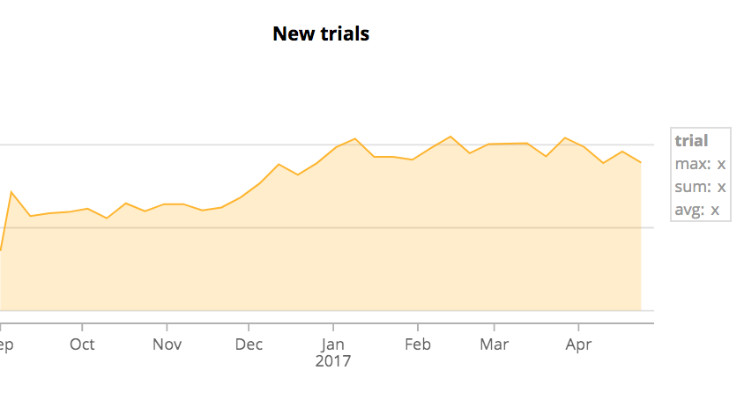
As this improvement can be considered as none-impressive because of the small percents, when mixed with scale:

it does the work, as the trials here are counted in hundreds.
The violet chart shows the number of people who installed the code and started testing LiveChat. As you can see, the quality of the traffic did not drop – double win.
Further tests
As CRO is a continuous process, within next month we did about 5-6 more tests on this landing page. These tests included:
- adding global navigation (result: a drop in Conversion Rate),
- changing headlines (no statistically significant results),
- adding scroll incentive, as we saw on scroll maps that people do not scroll to the next sections (positive, but not statistically significant),
- adding customers’ logos as social proof (result: a drop in Conversion Rate).
All next tests were done with dedicated to A/B testing software like Google Experiments and VWO. Unfortunately, none of them brought us as a high result as the initial one.
A mistake that solved our puzzle
I mentioned before that working on the context and design of the page has got us the highest impact change, as we were to found out later.
The later came a week ago, when we disabled the dynamic referrer by mistake. We didn’t have to wait long to see that it’s the context of referring domain that does the boost. Context and website narration is crucial in CRO. Keep that in mind.
Part IV. Conclusion
Since creating this landing page (December 2016), we’ve done a few dozens of tests on the LiveChat website. Although we’re still learning, we’ve already learned a few things.
The most crucial tip is to go for big wins instead of playing with small changes. You can test different colors of the button, but chances to find your silver bullet there are low. When you decide to test the entire landing page layout, or global navigation (and conversion paths), the chances go up.
These require more time (even days) of in-depth analysis, segmenting, user recordings, looking at the heat maps, but you will soon see that it’s worth the effort.
What are your experiences with CRO and A/B testing? Any great cases of success/failure?
Share them here! I’ll be more than happy to hear and comment on them.
Cheers and good luck with your testing!
